Design Plan
Fork already had an awesome logo and beautiful main color yellow. So I expanded from there, adding a few more colors and textures for the illustrations. Since the illustrations I imagined include texts with graphics, I decided to choose fonts that match well with Fork's identity.
Design Results
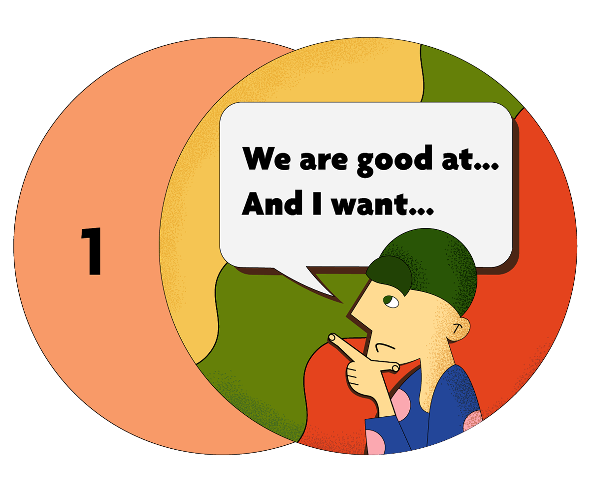
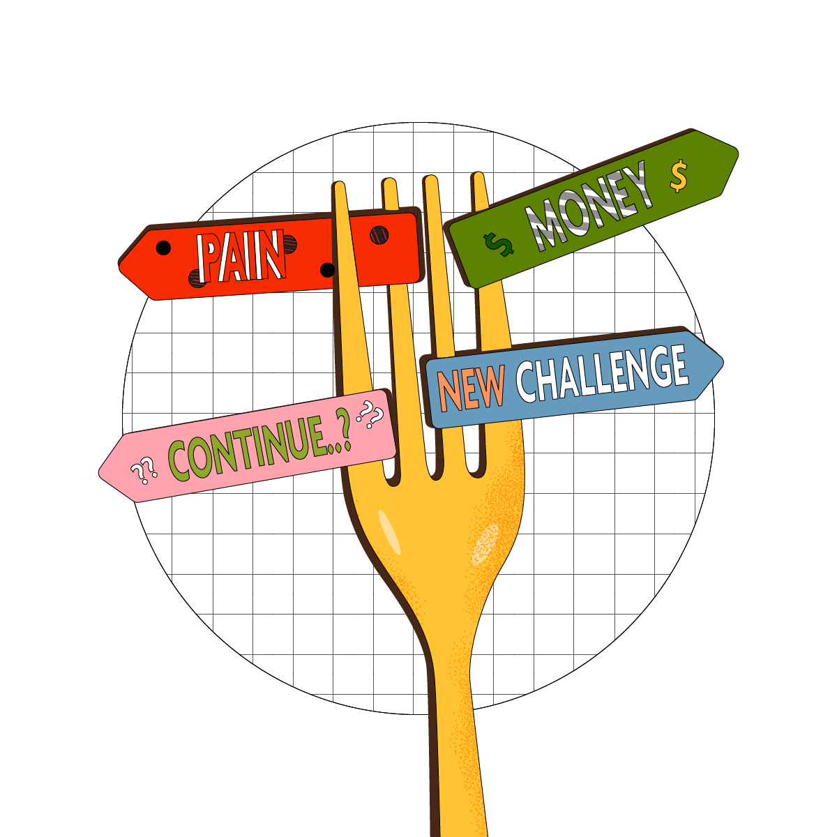
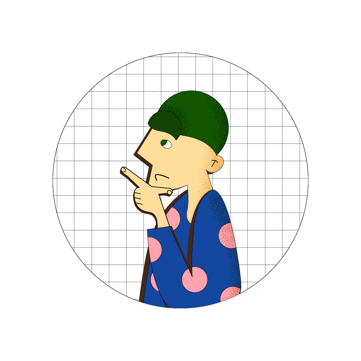
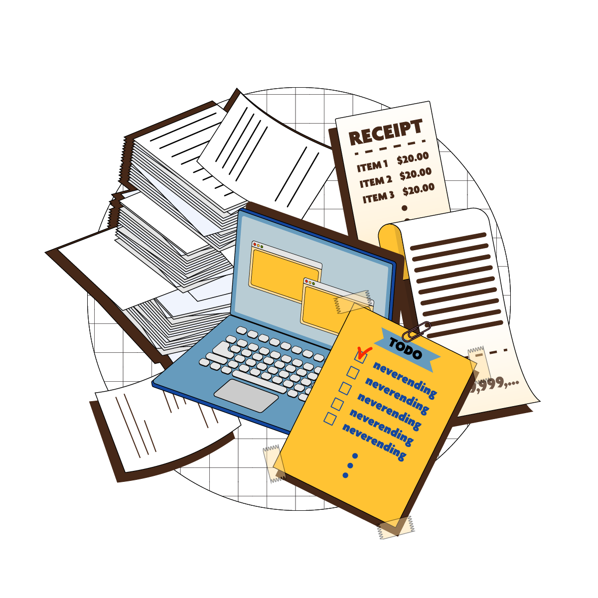
I wanted to capture founders' life and Fork's identity in this one illustration that'll be placed in the landing page header. Despite my never-ever-been-founder-before career, I put it together. Especially, I'm satisfied with the graphic of burdens on the entrepreneur character's shoulder.
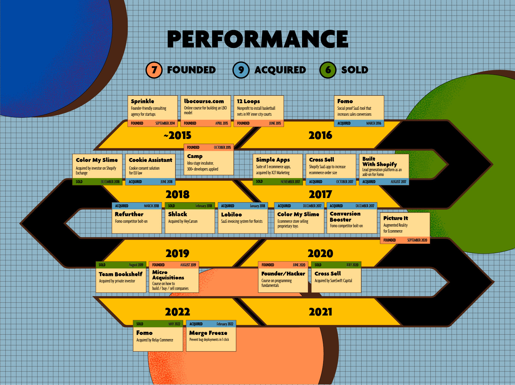
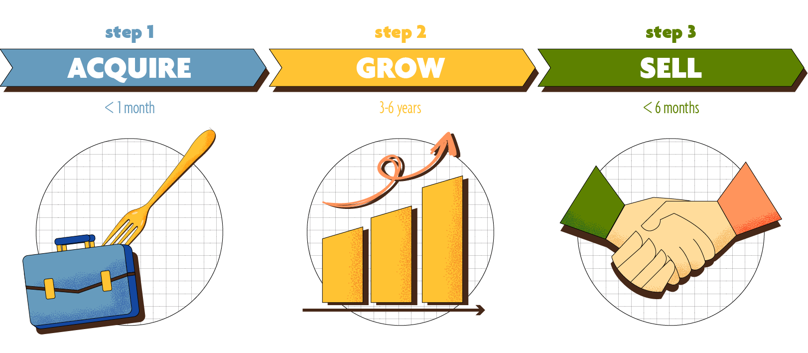
I also designed super long and still going-on Fork's timeline graphic and their pitch deck.

Fork Connect
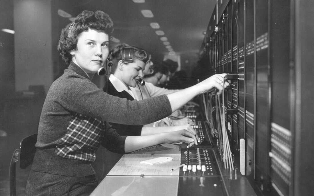
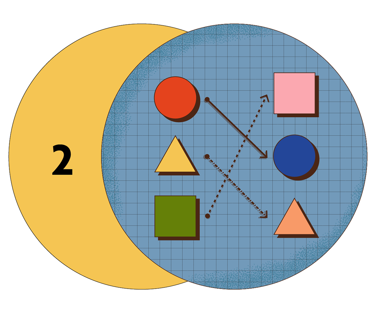
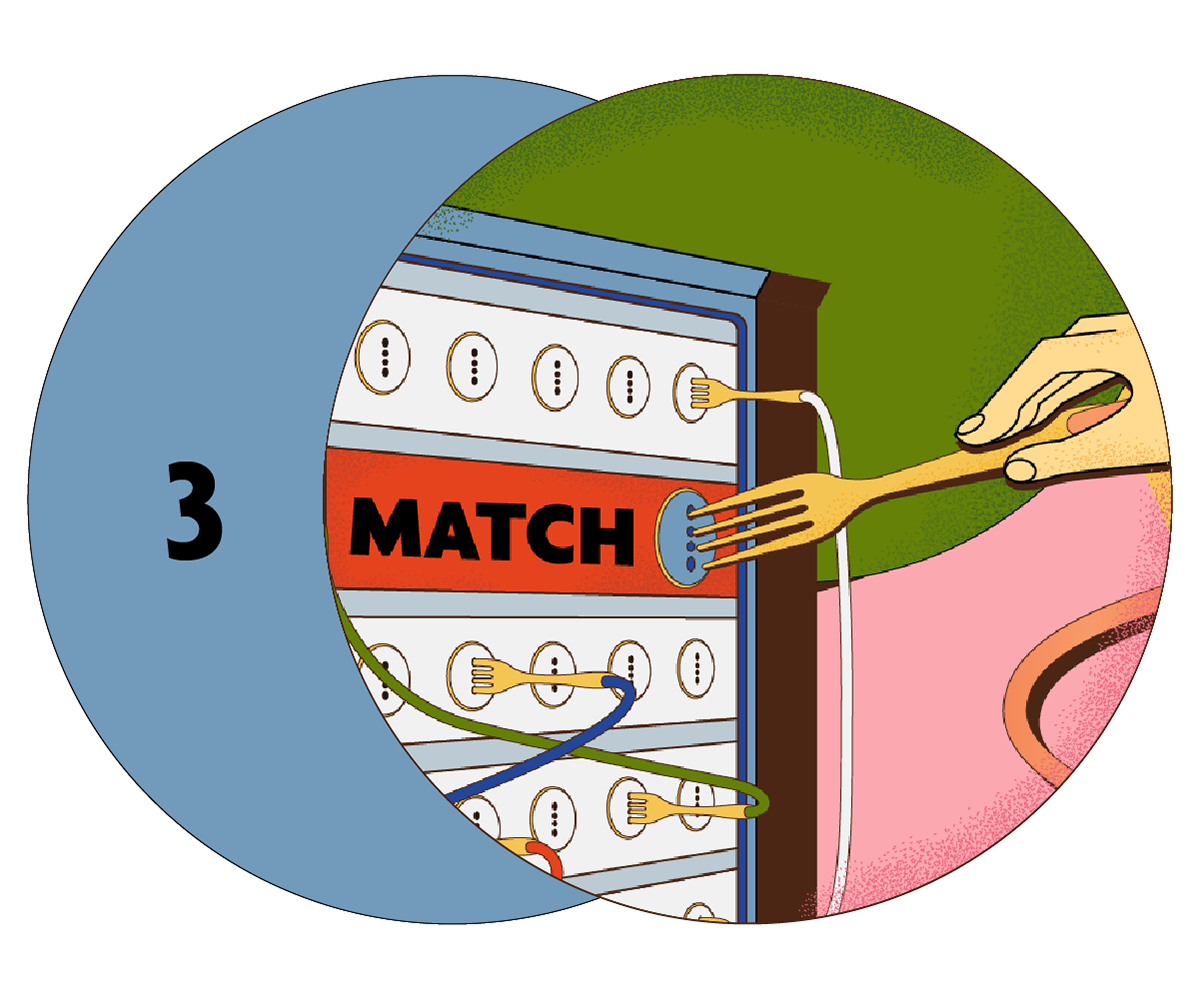
Ryan, the founder of Fork Equity, suggested old telephone switchboard image for the Fork Connect page main graphic and I thought I'm too young to know this but really brilliant concept. So I started drawing sketches and created Fork switchboard with literal forks.
FYI I also designed whole connect page website page so check it out!