Cosmonaut is a website you can learn the basic of Cosmos network and CosmWasm smart contracts. I participated as a designer for all the graphic assets, overall website design and turning design into tailwind css. I worked with 4 other team members, 3 of them managed web3 part and one front-end developer worked with me. It was such a fun project that I was solo designer of the team deciding every design decision and every other team member trusted my design :)
Design Plan
Theme: #retro #space #scifi #alien #let'sSaveTheEarth
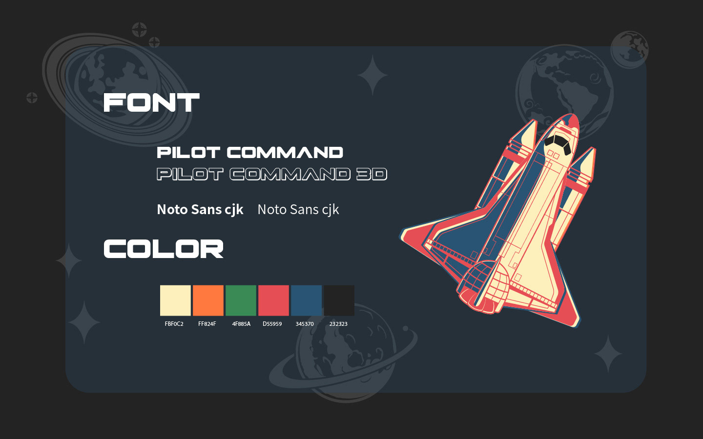
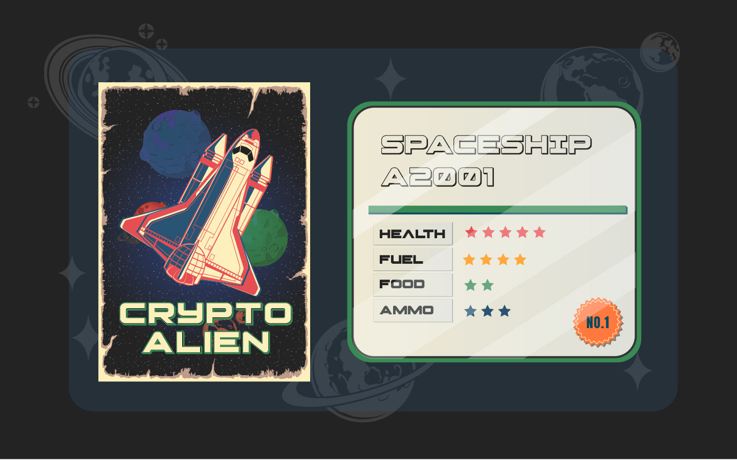
Graphic Assets
Each square poster represents each lesson. Left top to bottom right is lesson 1 to 6 posters. As the course is for the beginners of Cosmos network and CosmWasm contracts, the story is about astronaut getting ready for the journey to possibly meet the unknown creature in the space.
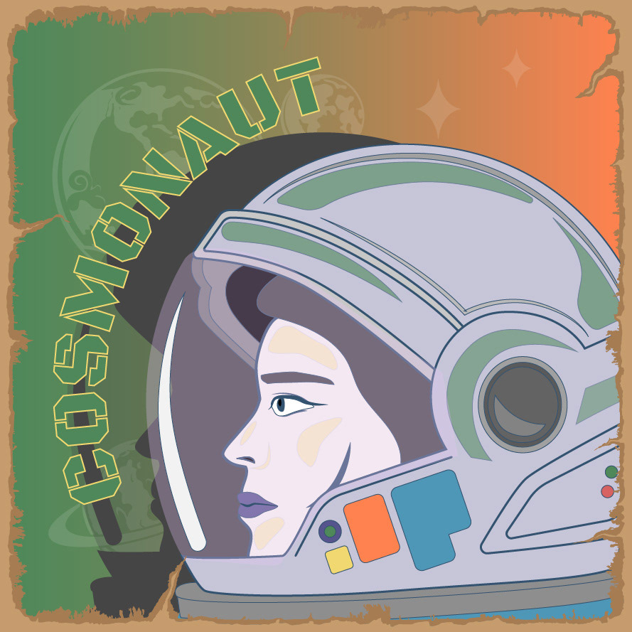
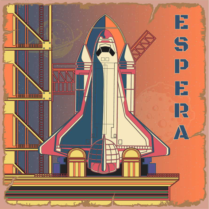
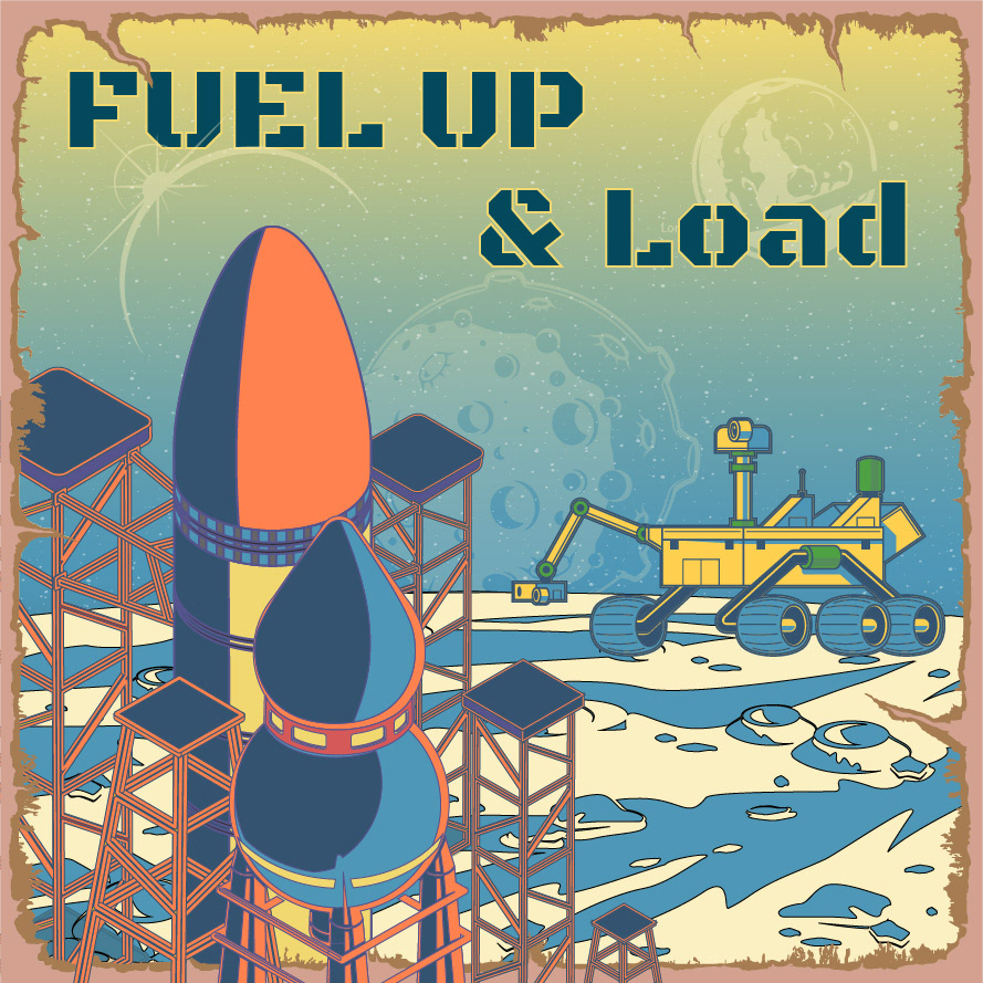
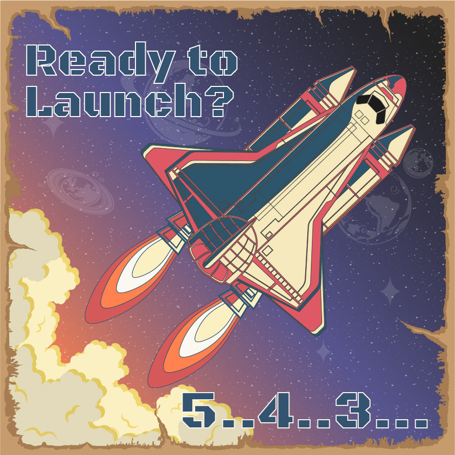
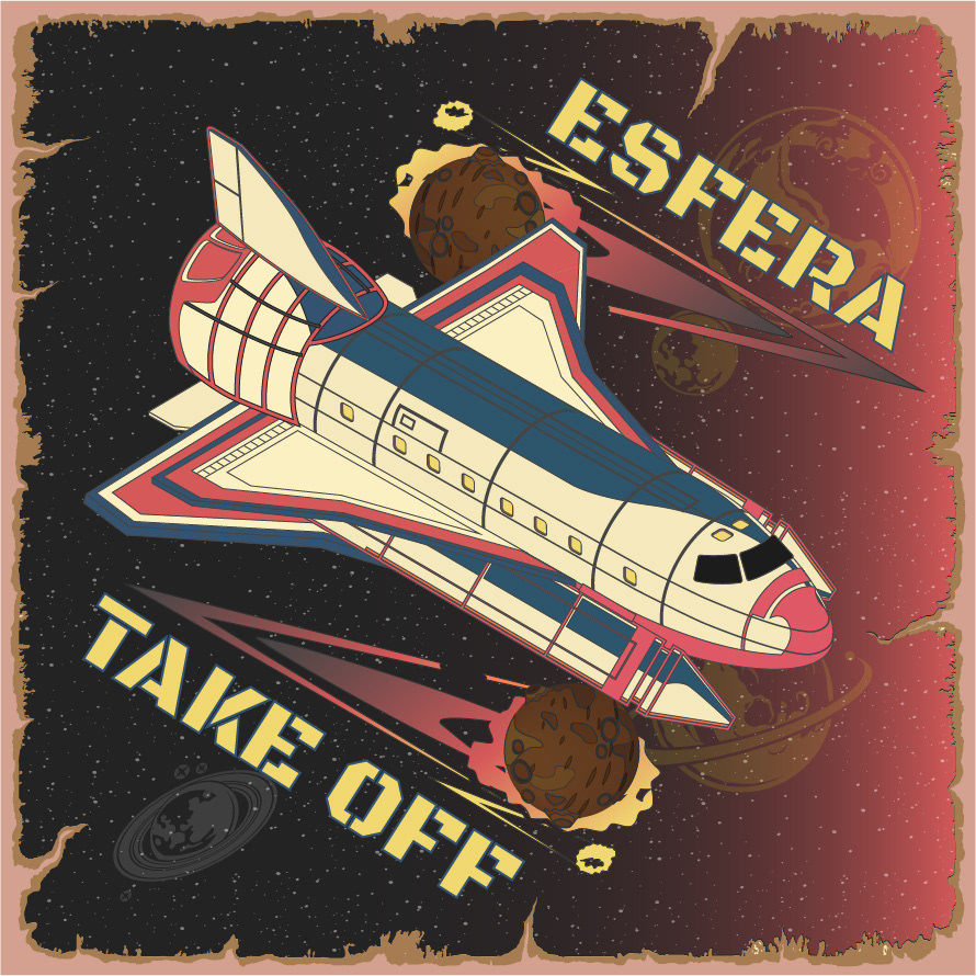
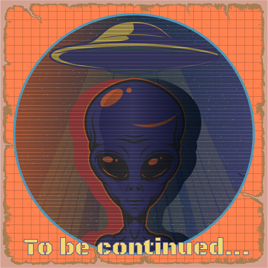
Website Background Graphic
For the immersive experience, our team try to put as many animation elements as possible in the website including this background graphic. This simple background graphic is created in After Effects and Photoshop and I'm writing this because I remember I and the front-end developer struggled big time figuring out how to put this size video or gif in the website since we were both very very rookie at the time. I hear ya that it's nothing burger for you.
How it used in the website
My poster graphic is used in 'My page' in the site showing your progress of taking lectures. Before you take lessons you're image is black & white and as you take lessons it changes to desaturated and finally when you finish it changes to full-color. I thought it's pretty nice perk at the time but now I'm rethinking I worry what if there's no one who see all of them in full-color...